Pixel pushing
I enjoy creating beautiful things. It’s what made me want to become a graphic designer and then later expand to design in the physical and digital space. But no matter what medium, a beautiful design also needs to work. And it needs to be accessible. It is made with an understanding of the technical possibilities, tools and standards.
CASE STUDY 07
Creating consistency through design patterns
Client
Hatch Invest (NZ), 2023
Role
Senior Product Designer
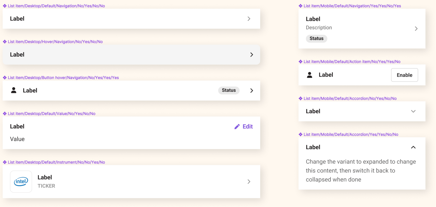
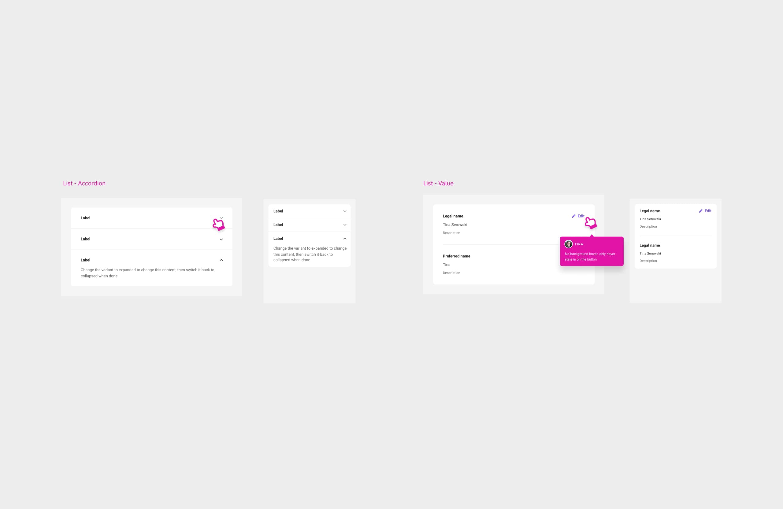
In 2022, a team of designers and front-end developers started defining and implementing Hatch’s UI patterns in a more strategic way. We founded Hatch’s design library and documented patterns bit by bit in Storybook.
Many UI elements needed a clean-up after they were introduced inconsistently over time. One of them was the list component, which I revisited as a design pattern. I reviewed all instances of the element and defined it’s appearance and behaviours depending on the use case and according to accessibility standards.


CASE STUDY 08
Responsive design
Client
Hatch Invest (NZ), 2023
Role
Digital Product Designer
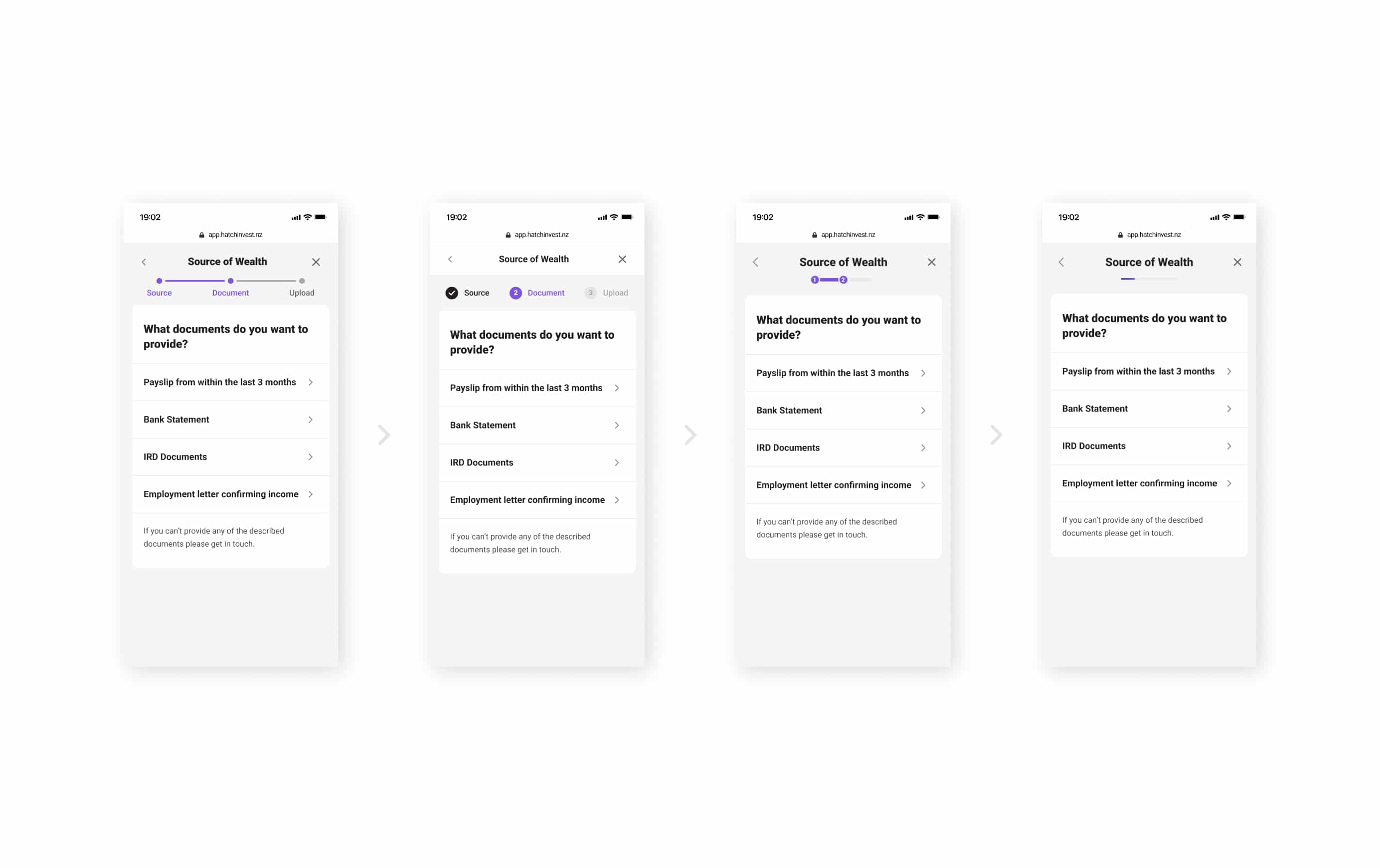
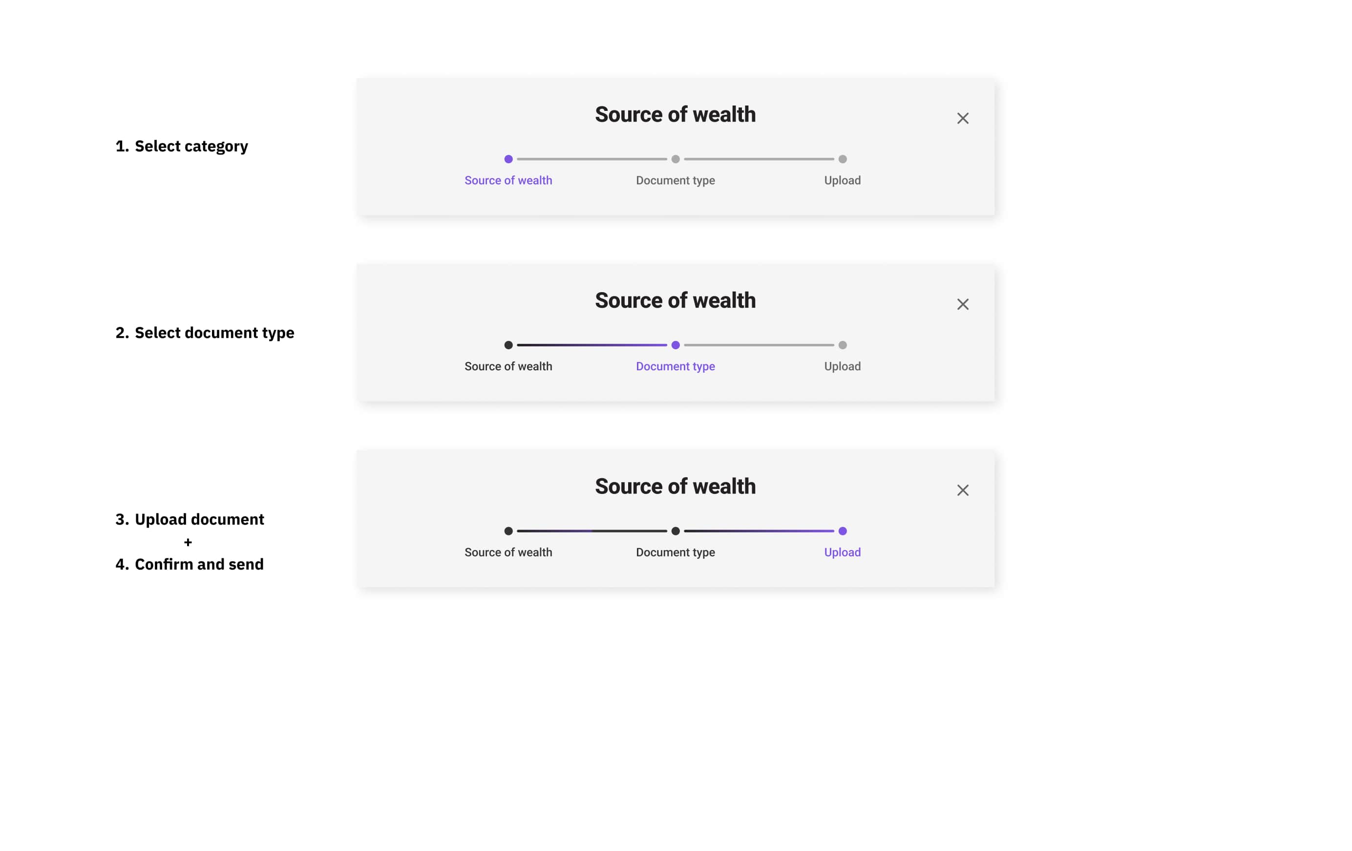
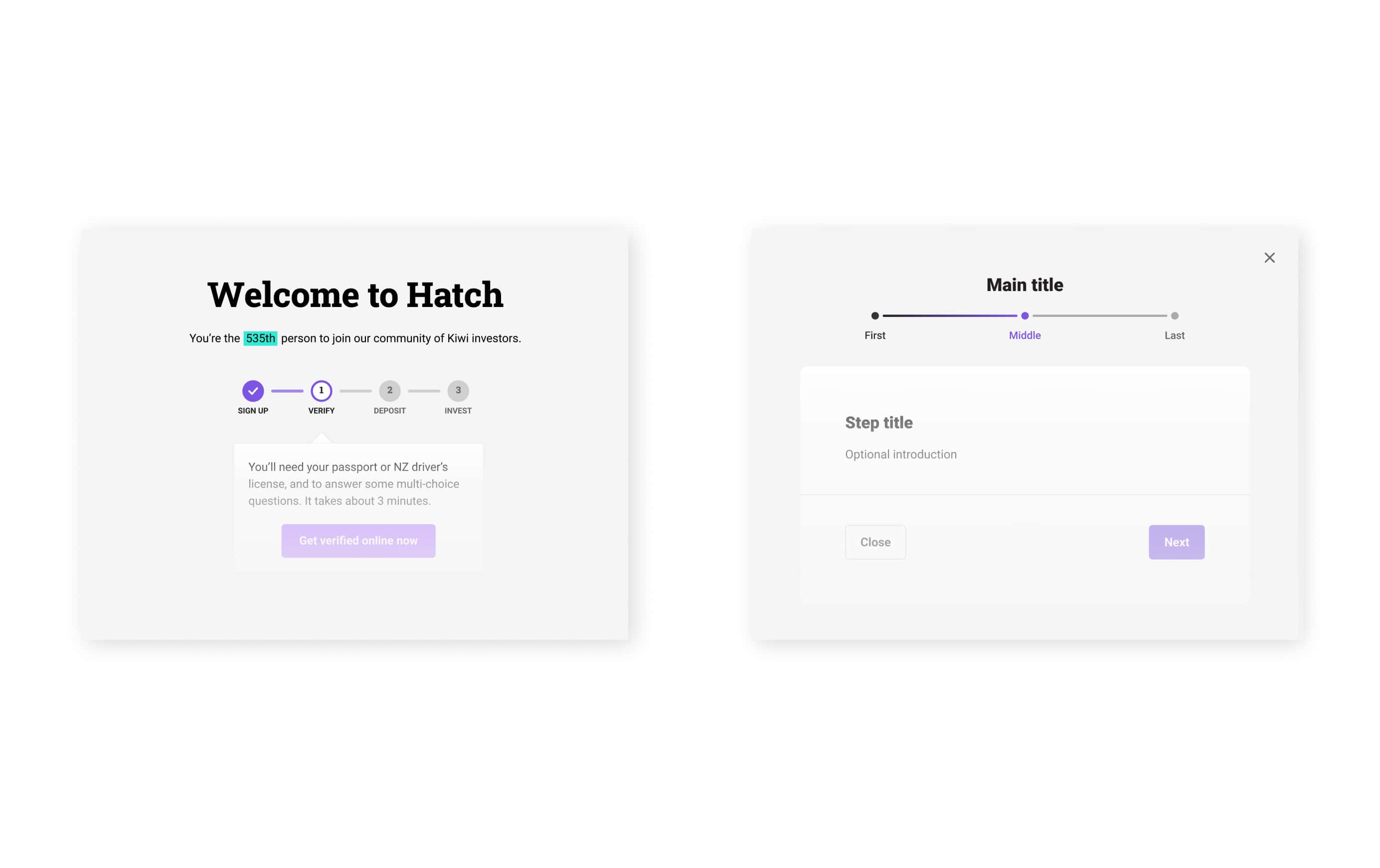
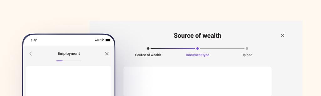
The digital experience of an investing platform has lots to explain. The concept of a stepper – a visual representing a multi-step process – got introduced as one of the key UI components to help navigate through complex processes. It appears during the on-boarding flow and regulatory check-ups. Now was the time to formalise it as a standard element for a modal dialog. This worked hand-in-hand with the re-design of the document upload experience.
Our preference was to have the same visual across all experiences: a sequence of a defined number of steps. But that had various downsides, especially for the mobile view. We agreed on an alternative navigation that was more inline with mobile UX principles. With only showing the current step, the navigation provided the essential information and gave space to more important content.